The Case for Joy in Branding

The Case for Joy in Branding
An argument against all neutral everything, and what happens when brands choose joy instead.
My default style is joyful. For me, design is play. I truly believe, in my bones, that the way colours, shapes and typography are arranged on a page or on a screen can influence the way we feel. It can put smiles on our faces. It can bring a little bit of joy into our day.
Ingrid Fetell Lee wrote a whole book about joy - Joyful - and one of her central findings is deceptively simple: bright colour makes people feel better. Measurably, reliably better. Her research spans psychology, neuroscience and cultural anthropology, and the pattern is undeniable. Vivid, saturated colour shows up again and again as a consistent trigger for positive feeling across vastly different cultures and contexts. She also points out something that every parent already knows intuitively - children will choose the brightest colour in the room, every time, without hesitation. If it clashes with your home’s ‘earthy neutral’ palette? So be it.
That instinct doesn't disappear in adulthood, it just gets educated out of us. We learn to reach for the beige, the safe, the understated. Fetell Lee's argument is that this costs us something, and I agree. It costs brands something, too.
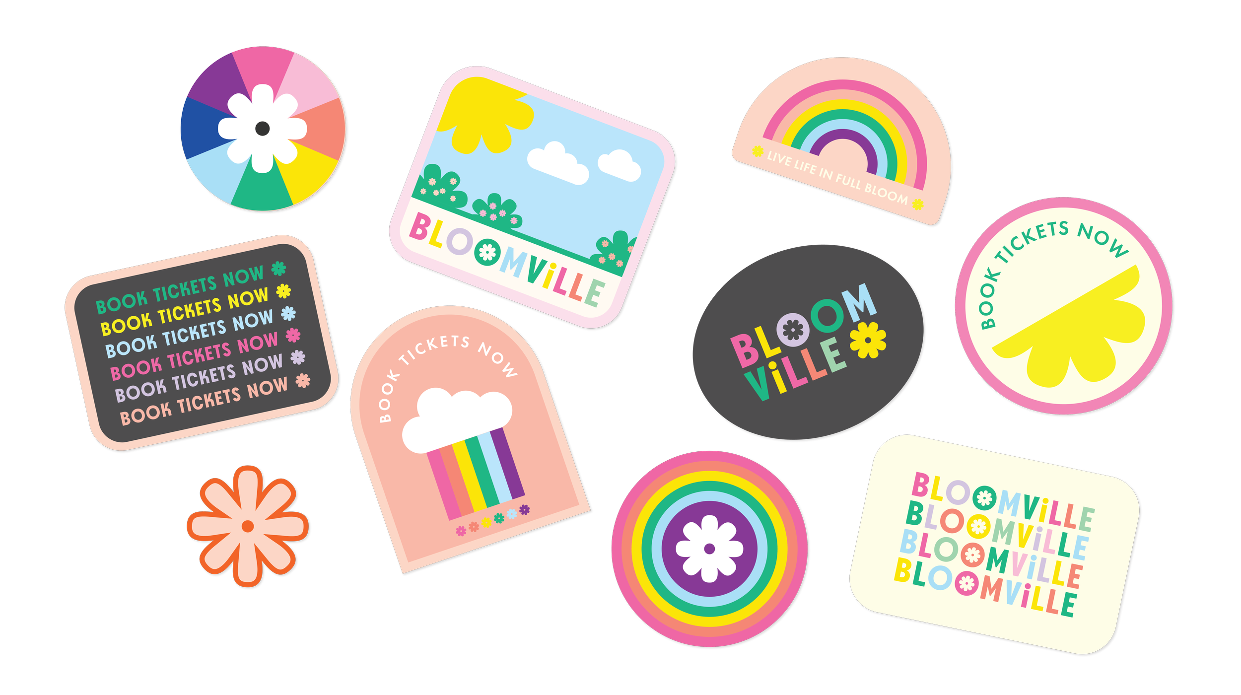
A collection of bright, cheerful stickers designed for the Bloomville activation at Woodlea Village
The first time I read Joyful, I felt as though words had been put to something I'd always known, but never been able to articulate. Design can be more than functional or beautiful. It can make people feel something. And that choosing joy is not always the soft, easy option, it can be a considered, powerful one.
And there’s a business case for joy. Emotional connection is one of the most powerful drivers of brand loyalty, and the research backs this up. Studies consistently show that emotionally connected customers are significantly more valuable over their lifetime than merely satisfied ones. This means joy is not just decoration, it can be a retention strategy.
Joyful design is about more than pumping up the saturation levels, though. One of my favourite tools is the imperfect line, the wobbly shape, the undeniably human-made element. I love to start my process with hand sketching, drawing naive shapes and elements and then bringing them onto my screen. They create a sense of connection, of approachability and recognition. Human-ness!
Pattern and repetition also help in upping the joy-factor by creating a feeling of dynamic energy, play and abundance. The intentional use of elements like these is about more than fun. They create the conditions for connection.
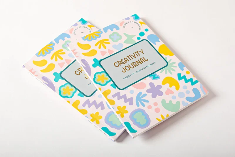
An playful pattern of organic shapes cover the surface of this Creativity Journal. Designed by me, for Journey of Something in 2022.
Maybe you've always wanted a brand with more personality. More colour, more life, more of you, but somewhere along the way you talked yourself out of it. Too risky. Too niche. Not professional enough. I hear you! I’ve been there, too, but I’m going to push back.
Joy is not a risk, it’s not a folly. It's a differentiator. In a world of safe choices and sameness, a brand that makes people feel good is valuable.
Be that brand.