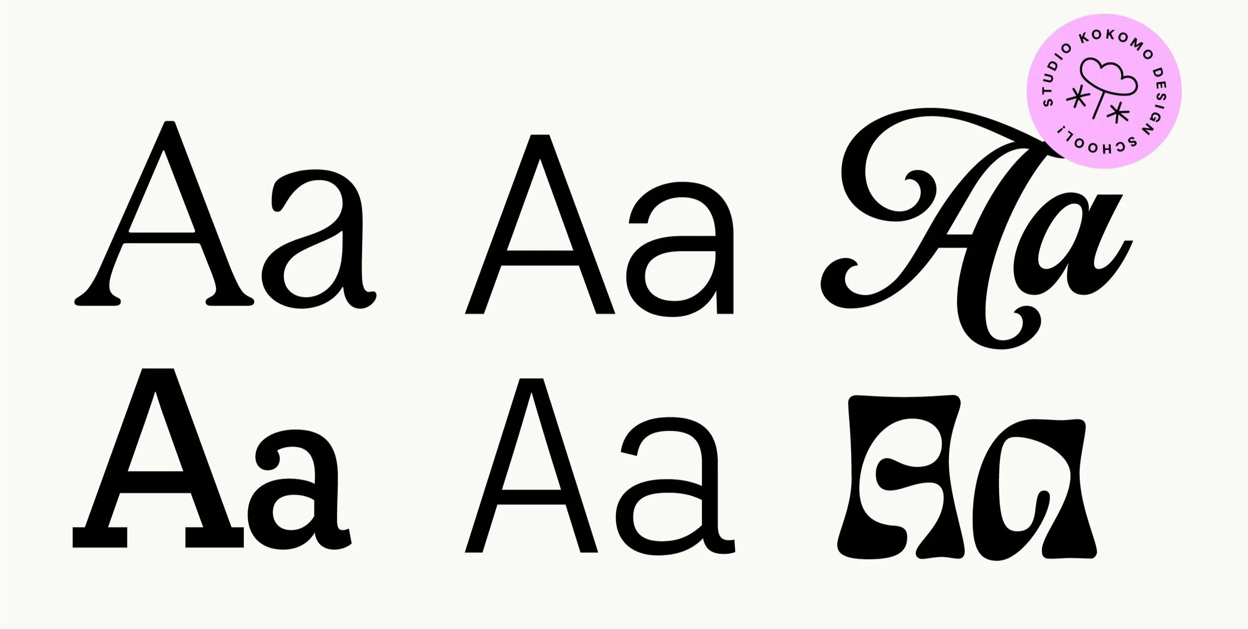
Welcome to Design School! I'm putting this series together to help demystify the language of design, so you can communicate more clearly with your designer. First up: typography.
Font choice and treatment is arguably the most important element of graphic design. Your choice of typeface is sending a message before anyone reads a word of your copy. Is the message playful or serious? Is your brand modern, or steeped in tradition? Are your products accessible and affordable, or do they command a premium price? Understanding the basics will help you and your designers make the best choices when it comes to typography.
Serif vs. sans serif
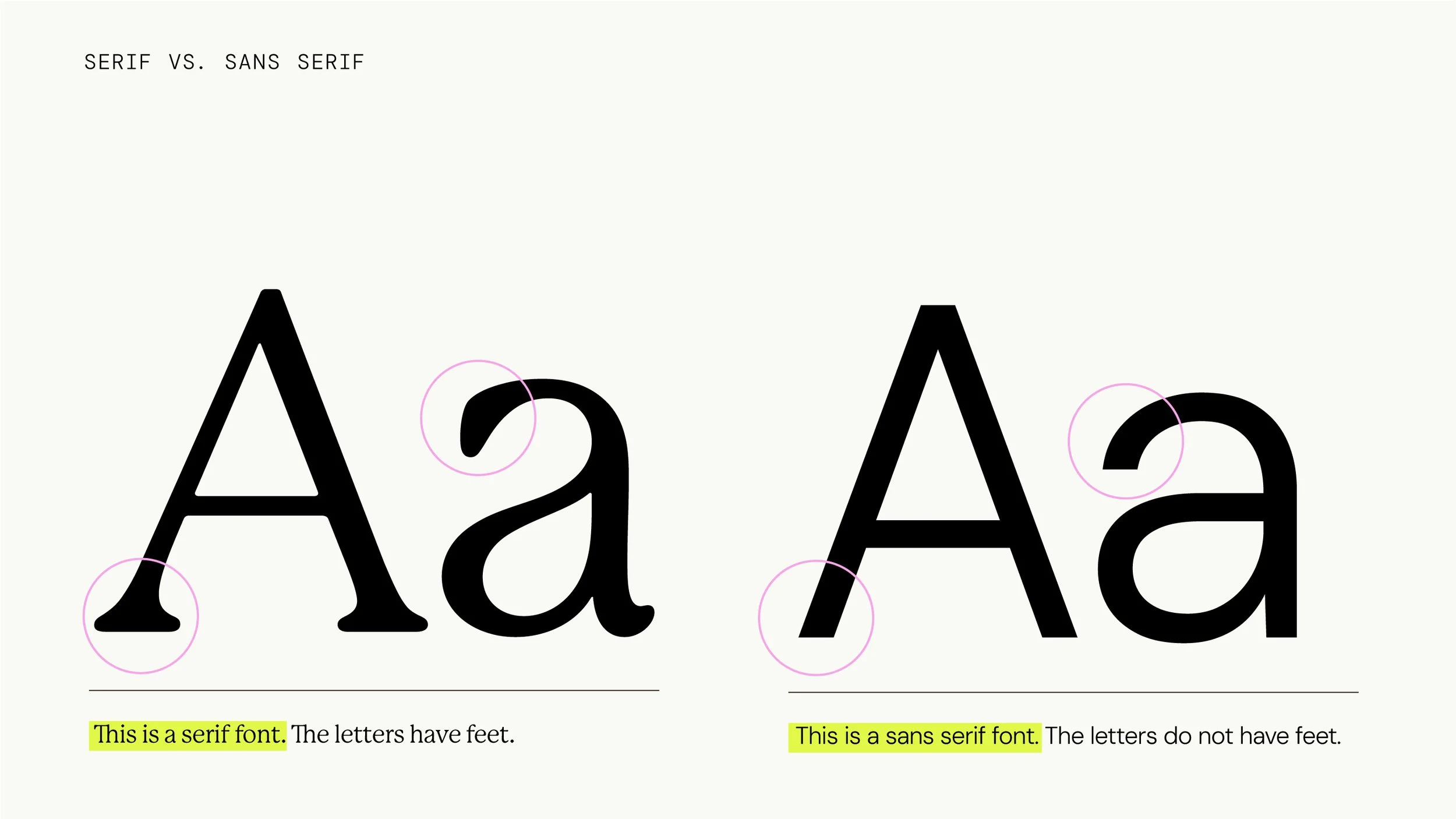
This is a probably the main differentiator when it comes to categorising fonts.
Serif fonts have little strokes (called "feet") at the ends of the letters. You know - Times New Roman. Serif fonts generally feel traditional, trustworthy, and editorial.
Sans serif fonts are footless - as in sans feet. The most well-known example of a sans is Helvetica. Sans serif fonts tend to feel cleaner, more modern, and more neutral.
Choosing fonts is part art, part science. There are conventions - a heritage wine label might lean towards a serif, an innovative tech brand might lean towards a sans serif - but it's important to assess each font on it's merits. There are also nuances within these categories that can change how they feel. For example, the roundness of the serif font I use in my branding gives it a sense of warmth and playfulness, rather than a traditional feeling.
But wait, there’s more…
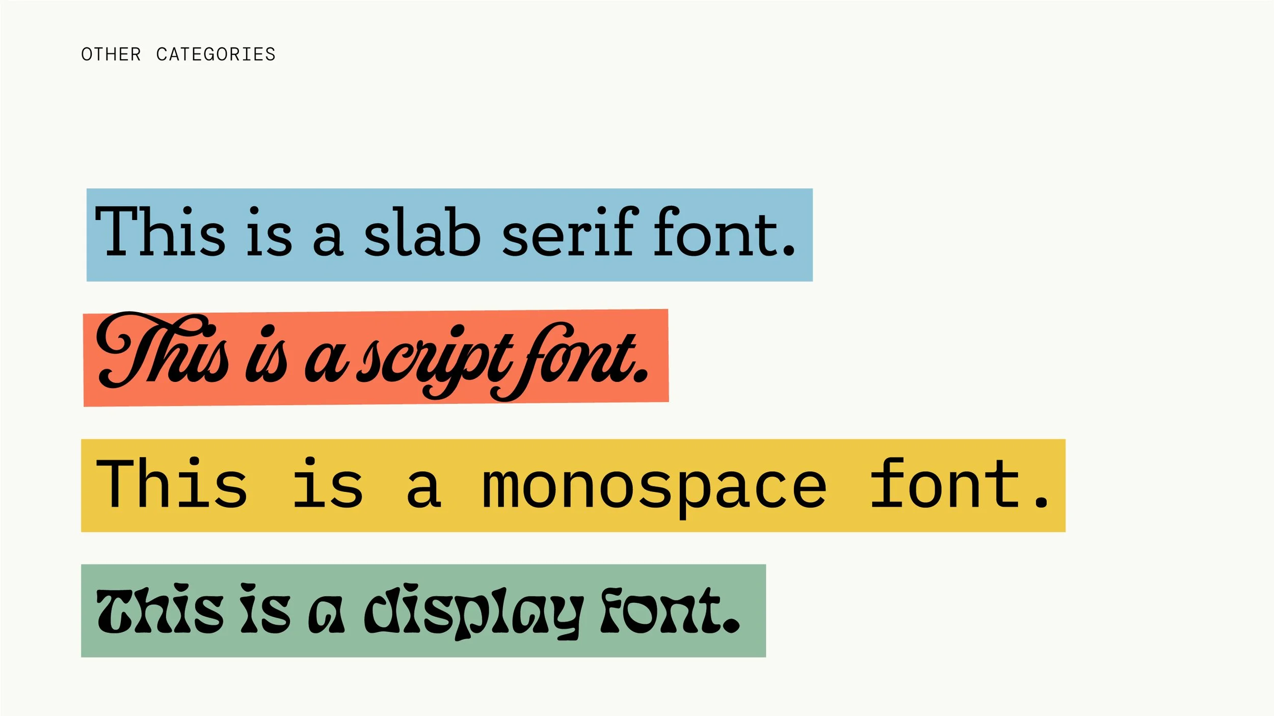
Serif and sans serif are the two main categories, but there are a few other common ones worth knowing about:
Slab serif: A bold blocky style of serif. The feet are thick and square which gives slab serifs a sturdy, confident and sometimes industrial feel.
Script: Fonts that mimic handwriting or calligraphy. These can range from elegant and flowing to casual and playful. But best used sparingly as they're hard to read in large blocks. And choose with caution - there are a lot of not-so-great script fonts out there!
Display: Fonts designed for impact rather than legibility. These are attention-grabbers are best used for headlines, logos, in places that call for personality over legibility.
Monospace: Fonts where every letter takes up the exact same width - like old typewriters. They have a technical, utilitarian and sometimes retro feel.
Why this matters to you
Understanding these categories and learning this vocabulary, will help you understand why certain choices are being made - why a heritage brand gets a serif and a playful one gets a sans, or why I might play with a script font for a logo but never (EVER) in a paragraph of body copy. You don't need to make the decision yourself! But understanding the reasoning means you can trust it, or push back on it with some context.