Design School: Anatomy of a typeface
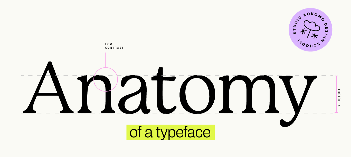
Welcome to Design School! I'm putting this series together to help demystify the language of design, so you can communicate more clearly with your designer. First up: typography.
Welcome back! In my last post, we looked at the difference between serif and a sans serif fonts, as well as touching on a few other font categories - slab serif, script, display and monospaced.
When it comes to font design, serif vs. sans serif is just the tip of the iceberg. There's a world of nuance in how fonts are built, and there are so many elements that separate a ‘nice’ font from one that's actually right for your brand.
Weight
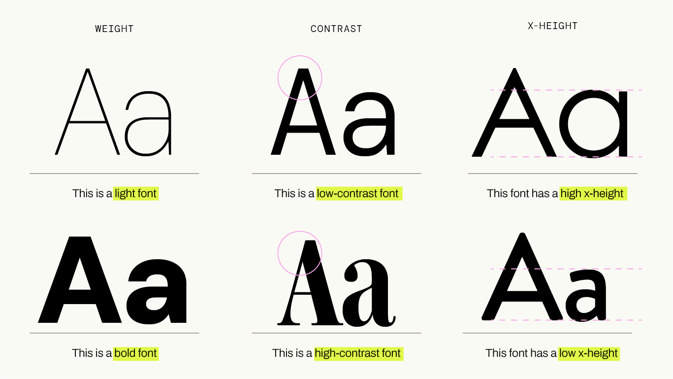
Weight describes how thick or thin the strokes of a font are. Many fonts come in a spectrum of weights - from Hairline to Black, with a range of weight in between. When considering what font to use for your brand, it's really useful to have one with at least a couple of weights to choose from. Sometimes you'll need a bold version for adding emphasis, or for more impactful subheadings. A brand font with only a single weight is really limiting.
Contrast
This is the variation of the weight of the strokes in a single letterform. Picture a really elegant sans serif font - chances are the vertical strokes are thicker than the horizontal. This would be classified as a 'high-contrast' font. These fonts look beautiful, but sometimes this contrast comes at the cost of legibility. Many sans serif fonts have very low or no contrast - the strokes of the letterforms are the same width both horizontally and vertically. These fonts are generally more legible and practical on screens.
Usually, a font with contrast will have thicker vertical than horizontal strokes, however there is a category of fonts where this is flipped. These “reverse contrast” fonts often look really quirky, and can have a Western flavour. Yeehah!
x-height
Getting into the nitty-gritty now - pull this out at the pub and impress your friends. The term 'x-height' describes the height of lowercase letters relative to capitals. A large x-height (lowercase letters that are not much shorter than caps) feels warm and friendly and is nice and legible. Smaller x-heights can feel more classic, but again, as with high-contrast fonts, this can come at the cost of legibility. My personal preference is always for a taller x-height.
Geometric vs. Humanist
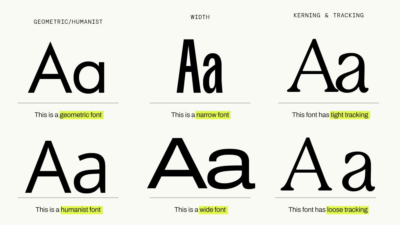
This describes the fundamental structure of the letters. Geometric fonts are built from clean shapes - perfect circles and squares - and the result is very clean and precise. Humanist fonts are a little more irregular, with hand-writing or calligraphy-inspired quirks, and less precise angles. They often feel warmer and have more character than geometric fonts. The differences between these two categories can be very subtle, but the overall impact can be powerful.
Width
Fonts also come in different widths, from condensed (narrow letters) through to extended (wide letters). Condensed is useful when space is tight, or for a headline that needs impact. Extended takes up more room and can feel spacious and confident. Most of the time your font will be somewhere in the middle, especially for body copy, but using widths at either extreme can be a really cool way to achieve a different feel - like using a really extended font for impact - or simply achieve a practical goal, such as fitting lots of text into limited space with a condensed font.
Kerning & Tracking
These aren't about the design of the letters as such, but they're just as important.
Kerning is the space between two specific letters - some letter pairs (like "AV" or "To") need adjustment so they don't look awkwardly close or too far apart.
Tracking is the same idea but applied evenly across a whole word or block of text, tightening or loosening the overall spacing. Get these wrong and even a beautiful font can look…off. Get them right and nobody notices. Which is the whole point.
Choosing fonts is such a skill! It’s riddled with nuance and usually best left to a designer. But understanding weight, x-height, contrast and the other basics will give you the ability to look at two fonts and articulate what's different about them, as well as arming you with the language you need when discussing font choice with your designer.
As with every element of graphic design, font choice comes down to so much more than personal preference. It's a myriad of small, deliberate details working together to create an overall impression. Get them right, and people feel it, even if they don’t know why.