Workable Law & IR

A confident, considered identity for a boutique law firm.

Workable Law & IR needed an identity that reflected the quality of its expertise while retaining the warmth and practical approach its clients value. A strategy and positioning stage informed two creative territories, with the chosen direction developed into a complete visual identity.

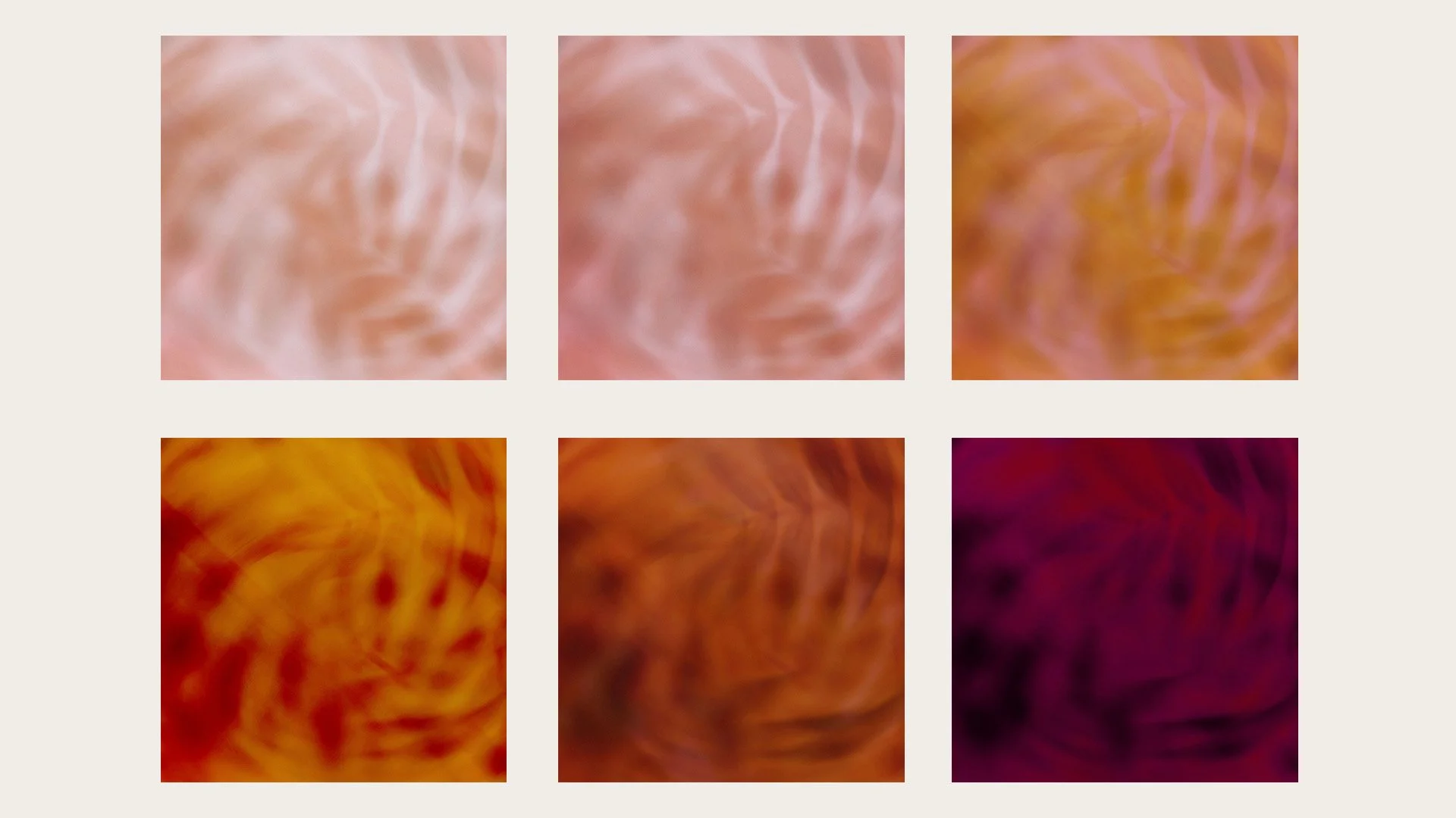
Refined typography, a warm, earthy palette and abstract botanical textures balance authority with approachability. The identity was rolled out across a new website, stationery, PowerPoint template, event banners and capability statement, creating a cohesive presence across print and digital.
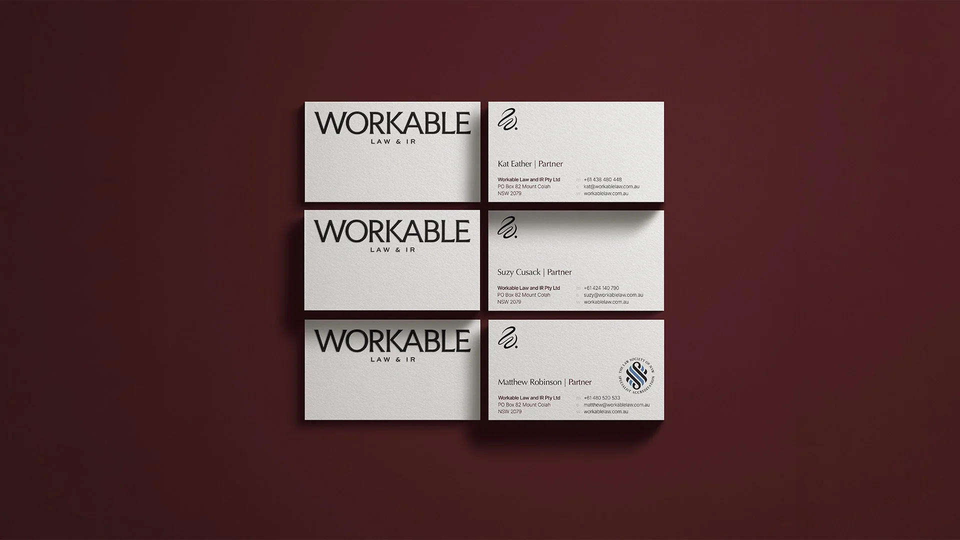


Front and back designs for Workable Law & IR business cards, featuring black typography and a flowing brand symbol on textured white stock.
 
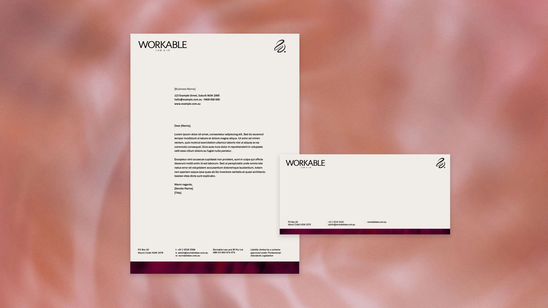
Workable Law & IR letterhead and envelope featuring black typography, a flowing brand symbol and burgundy accents on warm white.
 
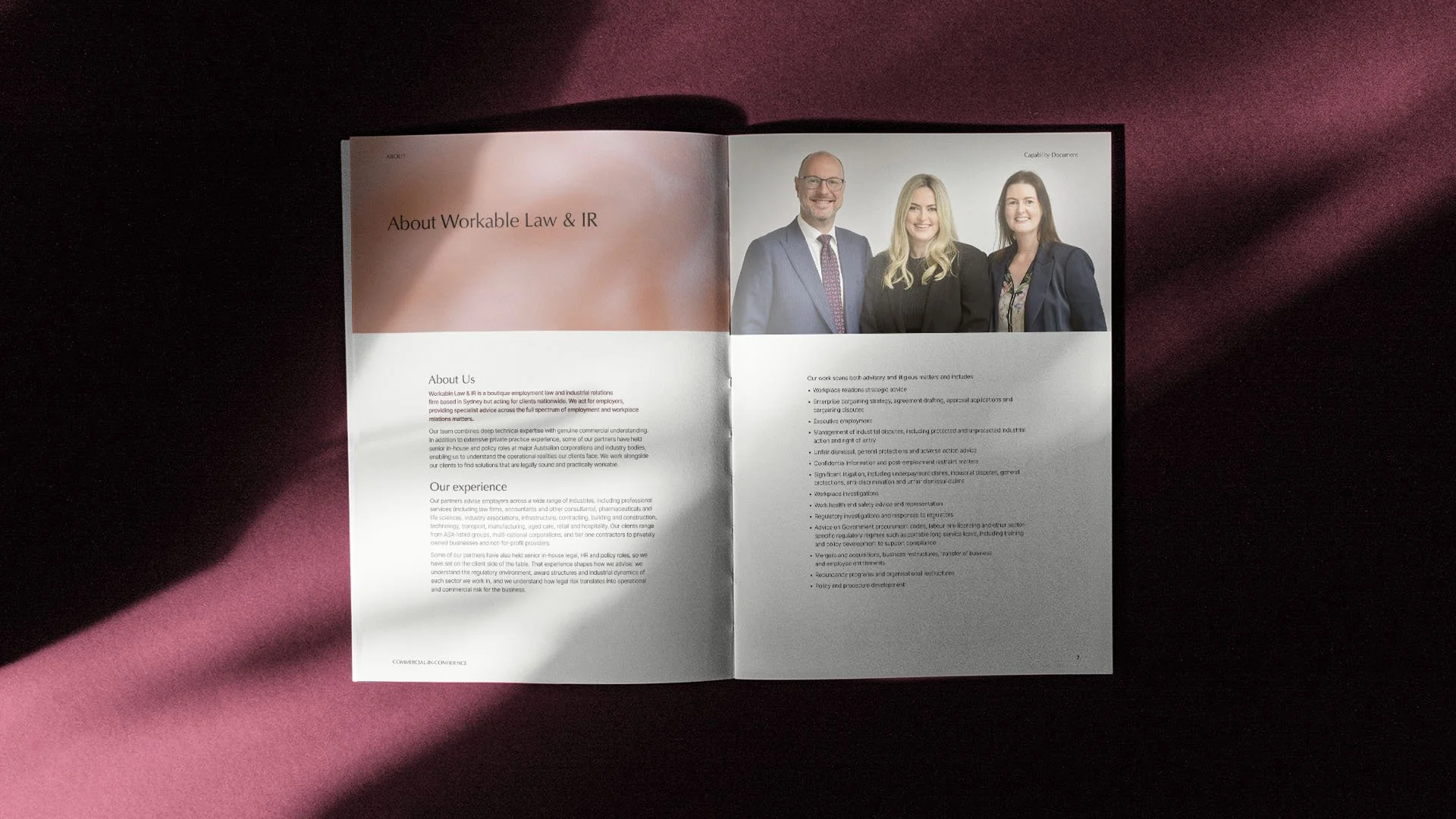
Open Workable Law & IR capability statement showing a double-page layout with blush abstract imagery, partner photography and sections outlining the firm’s experience and services.
Six abstract botanical textures created for Workable Law & IR, arranged in a grid in blush pink, terracotta, orange and deep burgundy.
 
 
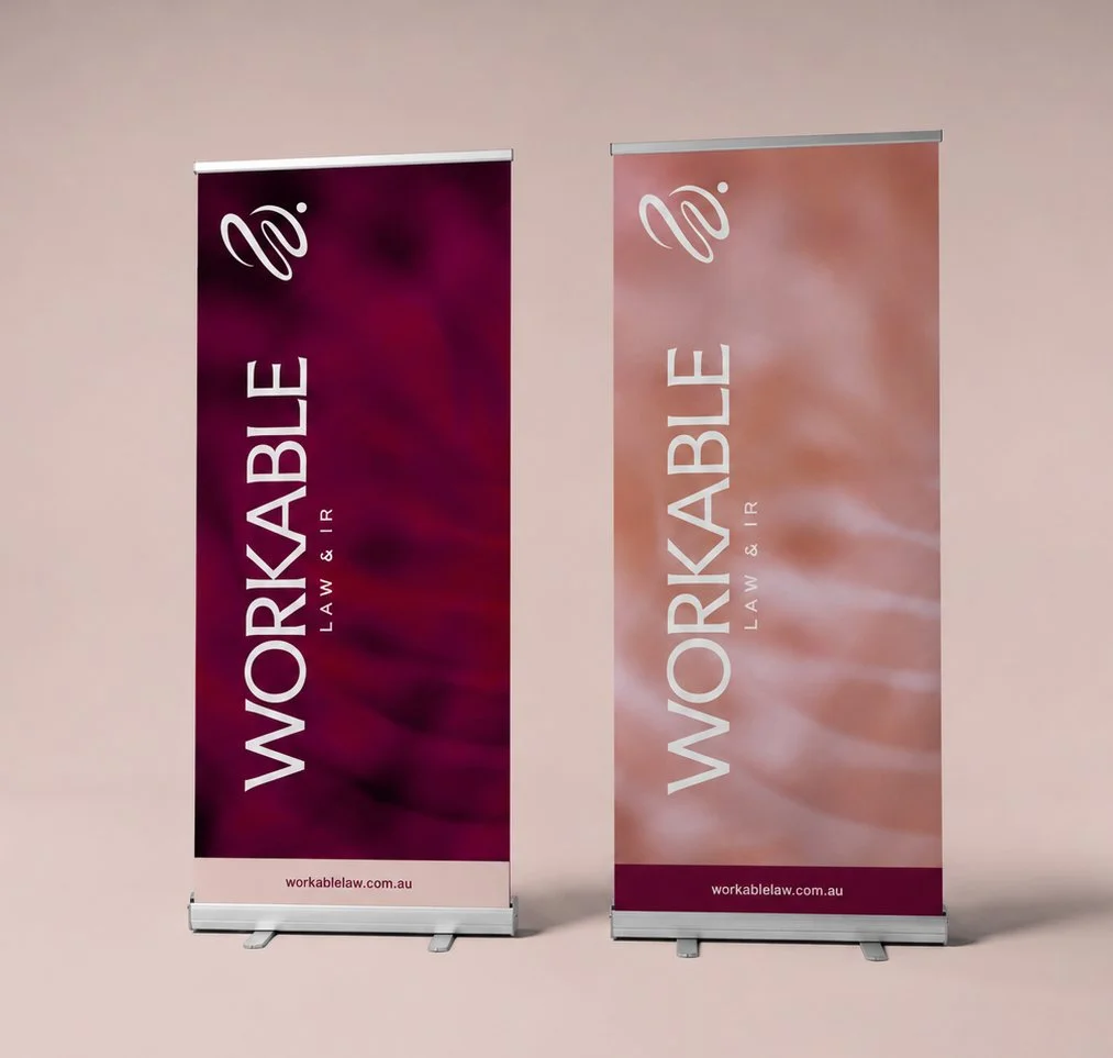
Two Workable Law & IR pull-up event banners featuring vertical cream logos and flowing brand symbols over burgundy and blush abstract botanical backgrounds.
 
Next
Next

mother/me